 If you ever catch yourself looking at advertisements while driving down the road, you may notice each ad is usually signed with the company’s logo. The logo is a small graphic gem, a visual representation of what that company stands for and what they offer their customers.
The Business of Branding
Creating a successful logo is one of the great challenges of designers and it’s essential for building a brand. Not only are they tasked with producing a graphic that communicates the important information about a company, but it also has to been done in a simple, effective way that can be transferred to all sorts of different media and occasions. Simply put, logos design takes some serious thought.
So what are the steps that go into logo design?
It all starts with the business. Graphic designers will ask what type of business is it? Who are the customers? What are their demographics? Is the company trying to attain a traditional classic look or a new, fresh look? These are some of the things you should consider in order to create a logo that accurately captures the culture of your company.
The Color Palette
 Color plays a big part in logo design as well. Colors such as blue, white and green are generally well liked and logos with these colors usually have a popular visual appeal. Red, orange and yellow are more aggressive colors and can communicate a new, ambitious company or a willingness to grow. Black is not a color but can be successfully used in combination with other colors to create a great logo. Note that most logos contain some color in order to draw attention from the human eye.
Typography is also very important in creating an aesthetically pleasing logo design. Serif fonts traditionally depict a more classic look and feel to the typography, while sans serif displays the font in a much cleaner, modern form. Many newer companies use sans serif fonts to communicate to viewers that they are modern, current and fresh. No matter which style you choose, it is important that you use a font that captures the ‘feel’ of your company while also remaining legible for all viewers. Choosing a font that can be hard to read is a common mistake in logo design and can lead to people dismissing your logo.
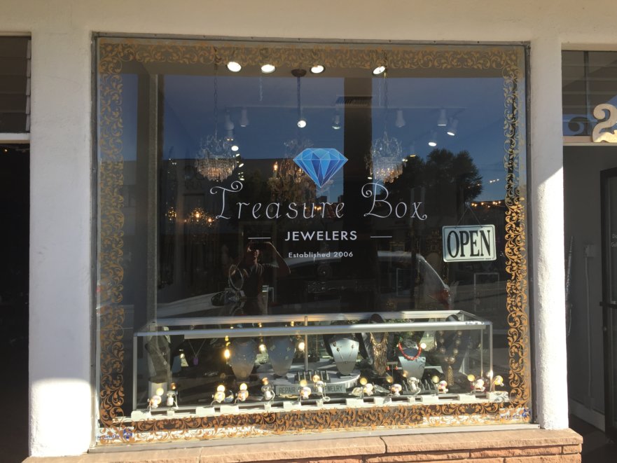
Finally, a graphic or symbol can be a huge part of your logo design. While many very popular logos have no graphic associated with them (IBM, Coca-Cola, Google), it is popular to create a symbol that embodies your company’s message, ideas and culture. People come to visually associate your company with this graphic or symbol, hence why logo design is so important (think of the Apple and Nike symbols). While choosing or creating a symbol for your logo can be overwhelming, here are some things to remember:
- Make it unique – if your logo is different from the rest it will stand out and allow your company to shine.
- Give it meaning – People like stories and having a cool story or idea behind your logo will make it remarkable.
- Keep it simple – Keep the graphic as simple as possible; remember, your logo will be going on lots of different media and surfaces and simplicity will make your logo universally adaptable.
These are some of the main points to remember when designing a logo, but having a clear vision of what you want is the best way to ensure that your logo design turns out exactly how you want it. That’s where the expert graphic designers can help. At Starfish Signs and Graphics, we specialize is visual storytelling and we will work with you to create a logo that allows you to Stand Out. Be Noticed. Get Results.
